

A Place to Unwind & Relax

La Dovecote Sarlat, is a beautifully restored character house and traditional stone farmhouse that features 3 ensuite B&B rooms plus a holiday rental. Situated in a tranquil green valley close to the medieval town of Sarlat. You have the wonderful sites of the region on your doorstep all waiting to be discovered.
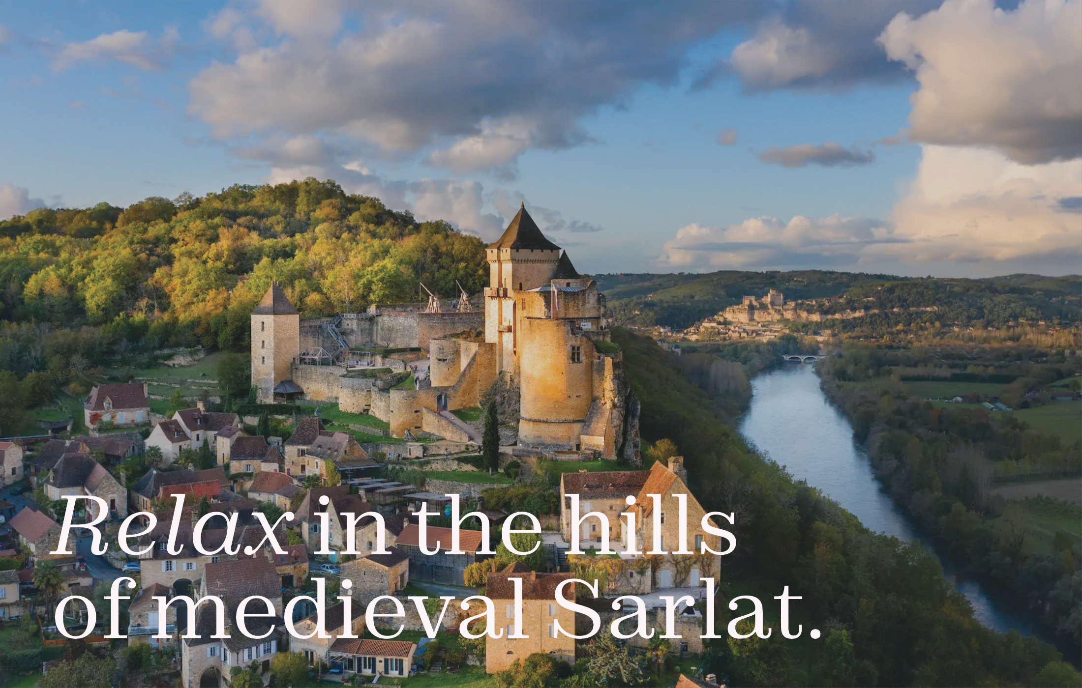
When Vanessa launched La Dovecote Sarlat, a beautifully restored character house and stone farmhouse offering three ensuite B&B rooms plus a holiday rental, she had charm, tranquillity and authentic French retreat vibes nailed. But visually? The business needed an identity that captured its unique soul: a tranquil valley hideaway just five minutes from medieval Sarlat and full of quiet elegance with modern comforts. Vanessa wanted branding that felt premium, rooted in history, but still lived in the now. That’s where we came in, redefining how guests would remember and recognise this unique retreat before they even arrive.


I went for a brand direction that’s both refined and a little poetic, something that whispers 'heritage' without veering into dusty, and ‘luxury’ without being flashy. Because the place itself sits somewhere between timeless stone architecture and calm, modern comfort, it deserved a visual identity that mirrored that. Think of it as old-world charm meeting intentional, contemporary hospitality. The concept leaned on subtle textures and restrained, elegant forms, nothing overtly ornate but grounded in the landscape, the sense of calm, and the promise of rest. It wasn’t just a logo; it was a prelude to the stay.
I centred the logo around the dovecote, such a quietly iconic element of rural Dordogne architecture and a beautiful metaphor for shelter, calm, and tradition. The form is simple, symmetrical, but with a gentle historic nod. It feels familiar and distinctive at once.
The palette? Soft, earthy tones, muted sandstone, mossy neutral green, pale limestone off-white, so that everything looks warm, natural, elegant (and survives any application, from stationery to website). Typography is a balanced serif with gentle curves, classic enough to feel established, but not overly rigid; paired with a clean sans serif for clarity and a conversational warmth. It builds a quietly confident premium voice.


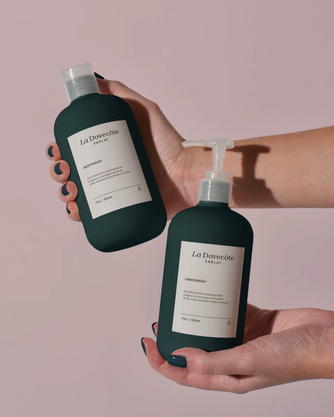

The result is an identity that sets La Dovecote Sarlat up as recognisable, premium, and perfectly positioned for success. Guests see the logo and palette and immediately sense the character, the calm, it's unmistakably dovecote-in-the-valley, but modern and inviting. Whether on the website, booking platforms, printed materials, or onsite signage, the brand now speaks with consistency and quiet confidence. In short: the identity has given Vanessa’s retreat a visual voice as refined and as lovely as the place itself.


TESTIMONIAL
“I can’t recommend Michael and this company highly enough. He did the branding/logo for my new Holiday let and B&B company. He guided me through every step and made sure that I understood and was happy at each stage. The result was more than I could have hoped for. I love my branding!”
Vanessa Johnson - La Dovecote