AURORA
Bold and refined elegance…
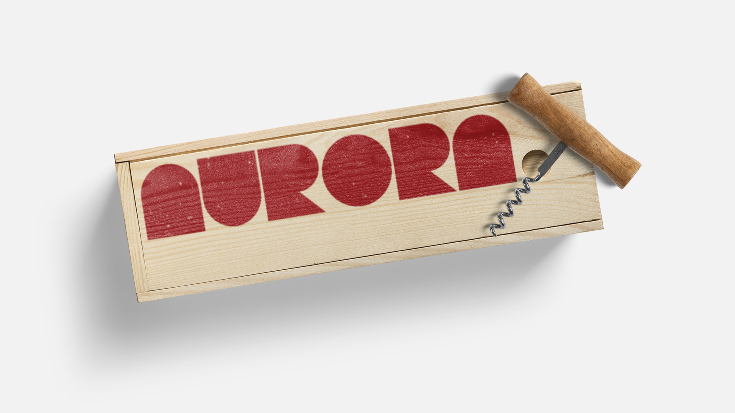
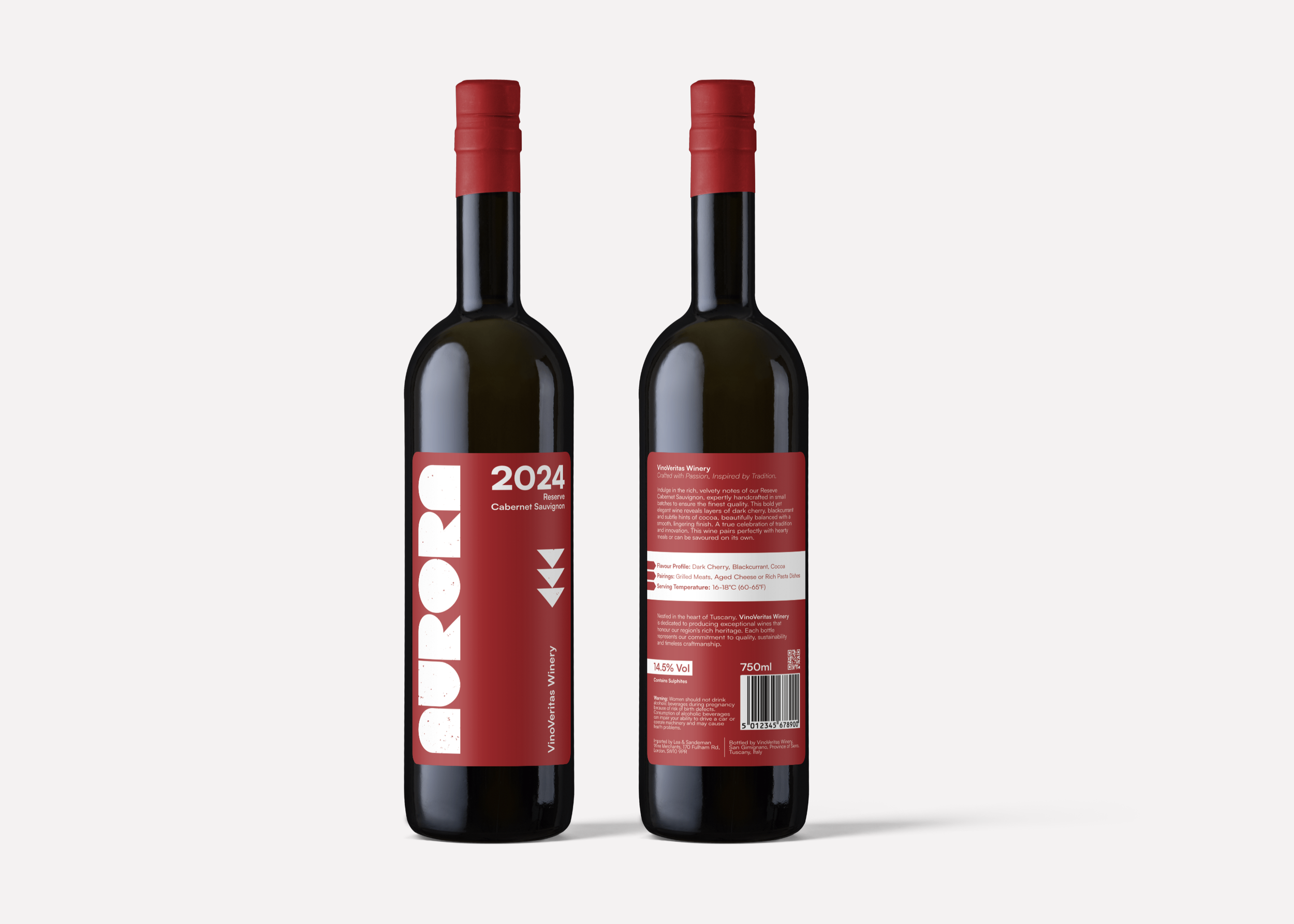
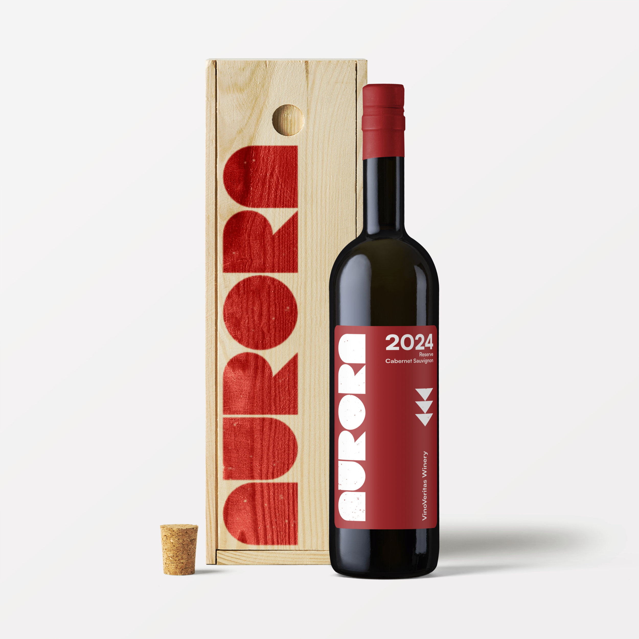
Aurora is a premium reserve Cabernet crafted to reflect depth, clarity and restraint. Designed for a modern wine audience, the identity balances elegance with strength, mirroring the wine’s bold character. The label and visual language draw from boldness and minimalism, giving the brand a refined, confident presence.
Project Overview…
Visual identity
Packaging
Label design
The identity for Aurora was built around a custom typographic logo, using bold block lettering treated as geometric forms. This gives the brand a strong, recognisable presence while avoiding traditional wine tropes. The visual system is rooted in minimalism — clean layouts, limited colour use and restrained typography ensure the label and packaging feel modern, confident and uncluttered.
By stripping away anything unnecessary, the design allows the product to take centre stage. It communicates quality through simplicity and form, creating impact on shelf without shouting. The functional, design-led approach speaks to a contemporary audience who value clarity, authenticity and understated confidence in the brands they choose.