
Rebranding The Deep
Rebranding The Deep: Strategic Brand Identity Design for a Cultural Landmark
As a brand designer, I specialise in revitalising established brands through purposeful and strategic design. This rebranding project for The Deep, a major UK aquarium and marine conservation centre was developed during my second year at university. It demonstrates how a strong visual identity can reposition a brand, sharpen its messaging, and create a deeper connection with the public.
Branding Brief: Reimagining a Regional Institution
The Deep is more than an aquarium. It plays a central role in Hull’s tourism, education, and marine conservation efforts. Like many established institutions, its existing identity had become outdated and inconsistent. This project reimagined The Deep’s brand to reflect its current mission, improve engagement, and align its visual language across physical and digital touch-points.
The goal was to develop a cohesive identity system that feels modern, intentional, and audience focused. It needed to connect with a wide demographic, including families, educators, and environmental advocates and work seamlessly across platforms including digital media, signage, merchandise, and educational materials.
Logo Design: Meaningful, Modern and Functional
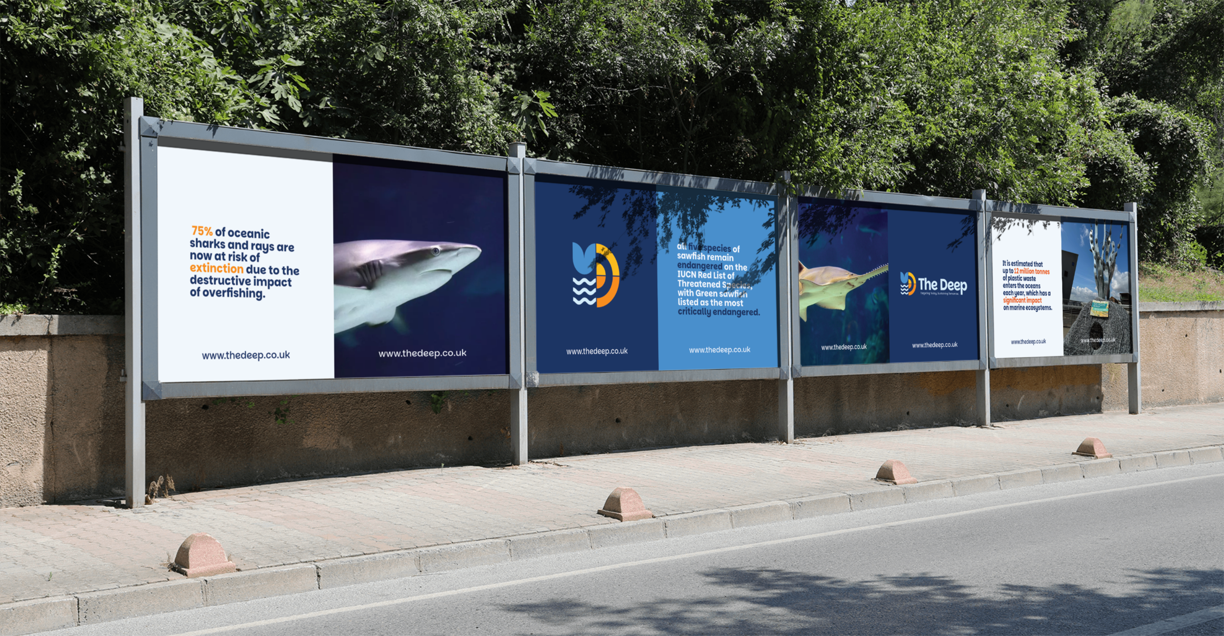
The redesigned logo brings together four symbolic elements: a fish tail, ocean waves, the sun, and a target. These represent marine life, the natural world, and The Deep’s commitment to conservation and education. The mark also forms a stylised letter D, reinforcing brand recognition and cohesion.
Built with geometric structure, the logo is clean, scalable, and versatile. It holds clarity and impact whether applied to small merchandise tags or large-format outdoor advertising. The result is a bold yet approachable brand mark that speaks to both authority and accessibility.
Visual Identity System: Modular, Adaptive and Consistent
The full identity system is rooted in clarity and flexibility. A minimal layout style supports high adaptability, while modular patterns add energy and movement. The colour palette combines muted neutrals with a deep navy base to convey professionalism without becoming cold. A wider colour palette incorporates a range of colours, enticing to younger visitors and forming a key part of the sites wayfinding. Typography is kept modern and readable with clean sans serif fonts.
Applications include wayfinding, branded merchandise, digital graphics, and print collateral. Large-scale awareness campaigns were designed with direct conservation messages to highlight The Deep’s mission and spark action.
Design Thinking: Purposeful and Practical
Every design decision was made with intent. Layouts follow grid systems and alignment rules to ensure clarity and professionalism across all applications. The brand tone balances credibility with approachability, welcoming for the public but serious enough for stakeholders, funders, and partners.
This work is grounded in real-world branding challenges: how to make a legacy institution feel current, relevant, and mission aligned. It demonstrates how visual identity can be used as a tool to unify communication and deepen public trust.
Why It Matters: Brand Design That Drives Real Impact
While created in an academic setting, this project reflects the kind of strategic, meaningful design that modern institutions need. Rebranding is not just about aesthetics, it is about infrastructure. A strong identity helps organisations stay relevant, communicate clearly, and connect with purpose.
Looking for intelligent branding that connects?
I work with organisations to build bold, strategic identities that cut through noise and deliver impact. If you are ready to reimagine your brand with clarity and purpose, let’s talk.